300+ Years of Color Theory: The Principles of Harmony and Contrasts of Colors
This book is included in a reading list on the history of Color Theory. Find the homepage for the series here.

The Principles of Harmony and Contrast of Colors and Their Applications to the Arts by Michel Eugéne Chevreul was a difficult read. Not because Chevreul’s ideas were difficult to understand, but because of the incredible level of detail in his writing, like list after list of how colors interact together.


M. E. Chevreul was a brilliant and beloved French chemist, appointed to oversee the state-controlled tapestry works Manufacture des Gobelins in 1824 by King Louis XVIII. Chevreul formed his ideas and principles about color interactions while working at The Gobelins, and conducted many experiments to discover how colors interact with each other.
His book influenced countless artists (Pissarro, Monet, and Delacroix, to name a few) as well as the overall Impressionism and Neo-Impressionism movements. The first edition of this book was published in 1839, and subsequently reprinted a number of times with a special edition in 1889 (to celebrate Chevreul’s 100th birthday), a facsimile of the 1889 volume reprinted again in 1969, and finally the Faber Birren edition published with biographical information and commentary in 1987. I highly recommend reading the Birren edition if you can find it (check your library first, then see if there is a copy available through interlibrary loan). The extra information was invaluable in getting through this meticulous volume.
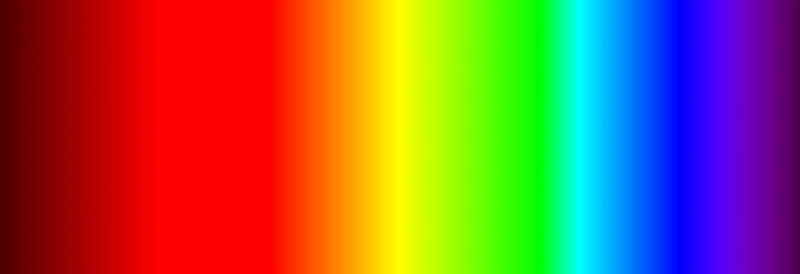
Chevreul was aware of Newton’s theories of light and mentions this early in his book. In explaining his own Color Theories, Chevreul focuses on the subtractive system of pigments where Red, Yellow, and Blue form the primary colors.
His color system is comprised of a basic color wheel containing 72 distinct hues, and a dome or hemisphere in which the 72 color hues are represented in other tints and shades.

This color wheel looks similar to the Artist’s color wheels of today; it includes the three Primary colors (red, yellow, blue), three Secondary colors (orange, green, violet), and six Tertiary colors (red-orange, orange-yellow, yellow-green, green-blue, blue-violet, violet-red). Each of these 12 sections is further broken down into 6 more divisions of color, making for a total of 72 individual hues. Chevreul felt his color wheel with 72 hues was the best to help determine true color relationships and harmonies.

His color sphere was an early attempt at a three-dimensional color space, showing how the hues in his system mixed with black and white to create graduated shades at the top of the sphere, and graduated tints below.
Based on his color wheel and sphere, Chevreul put forth several laws and rules of colors, all cataloged in great detail.
Based on his color wheel and sphere, Chevreul put forth several laws and rules of colors, all cataloged in great detail.
The Law of Simultaneous Contrasts
Through many examples and experiments (that you can recreate yourself with Chevreul’s detailed instructions), he presents the theory of Simultaneous Contrast. This can present as a contrast of value, where light and dark values interact in different ways. This can also present as a contrast of hue, where different hues interact in different ways. In contrasts of hue, the visual perception of simultaneous contrast also takes effect, where one color can create the optical illusion of a second color – which can affect the overall appearance of the colors viewed. And now begins the exhaustive lists in which Chevreul attempts to catalog all the effects noted when colors interact.
Just as with the previous books on Color Theory, this author also holds complementary colors (those directly opposite each other on the color wheel) in high regard for their special, vivid properties.
Just as with the previous books on Color Theory, this author also holds complementary colors (those directly opposite each other on the color wheel) in high regard for their special, vivid properties.
Harmony of Colors
Here, the author lists what he feels to be the most harmonious ways that we see colors. And there are more lists in this section! In a nutshell, these harmonies are:
- · One single, monotone color
- · Two colors of the same value
- · Analogous colors located next to each other on the color wheel
- · Widely spaced colors located on the color wheel
- · Various colors in the same tint, tone or shade
- · Harmonies of contrasts consisting of the same color of different value, analogous colors of different value, or of very different colors of similar value
- · Colors that look best when on a white, gray, or black ground
As if this wasn’t enough Color Theory to get artists motivated, the author continues on for several more chapters in his book with specific advice on how to use color when painting various subjects in virtually any lighting situation, when creating tapestry or textiles, printed fabrics, mosaics, stained glass, and staining or printing on paper. And, last but not least, Chevreul ends with a chapter on the subject of applying all of his theories to the specific practice of art criticism and appreciation.
Phew!
While Moses Harris was considered an accomplished artist, his simple Color Theory booklet looks like a self-published zine next to this massive volume from Chevreul! It’s no wonder so many artists were influenced by this book, especially those who worked with dots or spots of pure color applied directly to the canvas as a means to experiment with the interactions of colors described within these pages.


Comments