What Is Color Harmony?
Under the big umbrella of color theory, color harmony references the naturally satisfying combination of certain colors. These color harmonies can be found when any color system is charted out in a circle in color order. Read on to learn more about color harmonies, the color systems that are most often used in a color wheel, and how you can use a color wheel to create quick color sketches.
Most Popular Color Systems Used in a Color Wheel
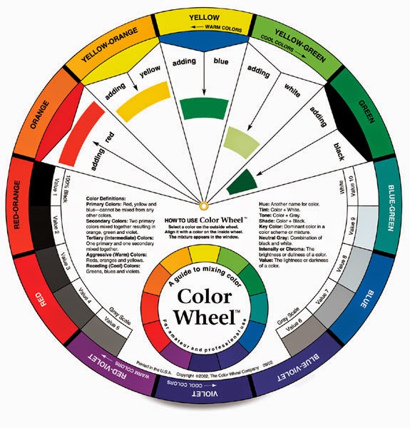
The most popular color systems used in a wheel are three pigment primary systems. In any of these systems a red hue, yellow hue, and blue hue combine to create other colors. We tellurians perceive pigments like paints to mix in this way because of our trichromatic color vision.
These include the RYB (red/yellow/blue) system, AKA the traditional color wheel or the artist's color wheel.
The CMY (cyan/magenta/yellow) system is another form of a three pigment primary system, AKA the printer's wheel or the partitive wheel.
Read more about basic color systems and wheels in my article here.
There are other color systems out there that are presented in a wheel, such as Ostwald and Munsell, but these systems include so many hues that it becomes difficult to use them to create quick color sketches.
On another note, I've seen colorists like Faber Birren make up his own color wheel based on his theory that humans perceive more warm colors than cool colors. If you're game, it's totally okay to make up your very own color system and try using it to play with color harmony.
If this is all new to you and you'd like to try playing with a color wheel, I suggest starting with the artist's RYB wheel. There are many nice RYB wheels with color harmonies printed right on them for sale, and you can easily find paper to match the 12 hues in the wheel.
If you are already a maker who works in an established color system, you might want to stick with it for making color harmony sketches. Or, switch wheels to see some different color effects!
Basic Color Harmonies on a Color Wheel
When any color system is displayed in color order around a circle or wheel, you can overlay different shapes and lines on the wheel to find color combinations that magically appear harmonious. Click to find an in-depth description of the basic harmonies along with free, printable Color Wheel Basic Harmony reference cards in my article here.
If you're purchasing a basic RYB or CMY wheel, look for one that includes basic harmonies in an overlay that turns on the wheel. This makes finding harmonies a breeze if you're just learning about playing with color harmonies.
Have fun exploring the traditional harmonies or create some of your own!
How to Create a Color Harmony With a Color Wheel
These color sketch grid studies are inspired directly by
Emily Noyes Vanderpoel's explorative color grids. She used basic grids as a way to investigate color relationships in a simple, clear way.
I'm going to show here how I've been using color grids to make quick color harmony sketches, but there really isn't a right or wrong way to use these types of grids. You can use your own tools and materials to create small sketches and studies in a way that works best for you.
Materials to Create Color Harmony Grids
- Color wheel of choice
- Colored paper matching the hues in your color wheel (Color Aid papers offer the closest matches to true hues, but are expensive. I've also found that Astrobrights color pack "Spectrum" offers close enough hues to both RYB and CMY to create color studies at a really affordable price. Scrapbooking papers also make a decent hue match with either a "primaries" type pack of solids or just taking your color wheel into the store and purchasing single sheets to match.)
- Base paper for creating grids (use a scrapbook, sketchbook, or single sheets of cardstock)
- Tools to cut paper into squares (I mostly use a hobby knife with #11 blade + cutting mat + metal ruler. You could also use a rotary cutter + cutting mat + clear ruler, or ruler + pencil + scissors. Whatever works best for you.)
- Adhesive of choice (glue stick works great for paper, glue squares work better for heavy cardstock or Color Aid paper)
- Recycle bin
Gather together all of your materials. Based on the size of your scrapbook or sketchbook, decide what size grid you're using so you know how to cut your paper squares. I think if you stick to making color sketch grids in the same way, shape, and size, it makes for easier comparisons when looking back over previous sketches.
My scrapbook is a second-hand record book purchased from a
science surplus store, it has 9" x 7 3/4" grids on each page. I worked out how to fit colored squares in a 3:4 ration on each page by cutting each square about 2" x 2". This works out to 12 squares total for each sketch. You can always use more squares in your grid, format your grid in any size/shape you want, or work on any size base paper.
To begin, select a color harmony on the wheel. I'm going with a split complement of blue, yellow green, and orange - you can see the small triangle in the middle of the wheel that says "Split Complement."
Find the coordinating paper hues and cut your squares. I decide to work with these 3 color in equal parts to best view the color harmony, and since my grid = 12 squares, I cut 4 of each color to fill the grid.
Then I start playing around with the composition of the grid with the colored squares.
This is probably my favorite part, as it feels a bit like a puzzle! I know when I find a layout I like, then glue it down.
Last but not least, I add the information to the page about what the combination means, and which color system I used, and date the bottom of the page.
That's it!
Relatively quick to do, and I like having all the grids in one book to page through when I feel like it.
I started filling my book on both pages, but decided to just do one per page to save bulk in the book and to give each grid room to be viewed without the influence of colors on the other page.
Here's one way these sketches can help you explore your color preferences. After doing these color wheel harmonies for a few days, I discovered that I was avoiding orange, and using lots of red. I love red, like, it's my favorite color ever. I always seem to run out of red fabric. So no surprises there.
But the orange, I had no idea I was subconsciously avoiding using this color. So I did a series of several pages of harmonies that included orange, forcing myself to think about orange in a new way.
So I discovered that I'm really not a fan of orange, but don't mind the color in combinations where orange is minimal. This is the stuff I really love about playing with color harmony!
I hope you are inspired to try some color harmony play in your own way, and maybe to incorporate what you learn about your own color preferences into your work.
This post is one in a series about making color sketches.
This is How to Create a Color Study With Color Harmony.
Find How to Create a Color Study With Representational Colors here.


_Wellcome_L0019270.jpg)
Comments