300+ Years of Color Theory: The Color Primer
This book is included in a reading list on the history of Color Theory. Find the homepage for the series here.
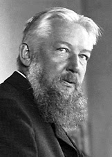
Wilhelm Ostwald was an amazing scientist who was awarded the Nobel Prize in 1909 for Chemistry for his work on catalysis, chemical equilibria, and reaction velocities. His color system put forth in his book, The Color Primer (first published in 1916) is considered one of the most widely published books on the subject of color theory.
His system is one of the most beautiful I’ve ever seen, and is still one of my favorites. Ostwald bases his system on human perception of color values of hue, saturation, and brightness, all arranged in a three-dimensional shape. His system includes a color notation system to give each color in the solid an exact code.
Where most other color systems that pre-date Ostwald are based on a three-primary color system (the Subtractive color system of red, yellow, and blue, or the Additive system of red, green, and blue), this system uses black/white in the vertical center axis, and red, yellow, green, and blue along the circumference of the color solid. These color pairs, black/white, red/green, and blue/yellow, are the central color pairs of the Opponent Color Process. These three color pairs are sometimes called the psychological colors, as the opponent color process is a process of the mind.
The basic colors along the perimeter of the color solid are numbered in sections, with each major color group being assigned three numbers. From here, the colors are mixed in gradations; white moving towards the top cone, black moving towards the bottom cone, and gray moving in towards the center pole.
Pull out one color “piece” of the color solid, and you’ll see a selection of tints, tones, and shades for one color.
Pull out an entire section of the color solid, and you’ll see tints, tones, and shades across two color complements.
In fact, you can cut, slice, or dice this color solid in any direction to see completely new and interesting combinations of colors. Ostwald dedicated an entire chapter of The Color Primer to color harmonies, in which he likens harmony to order in arrangements of colors within his color solid. As is the rest of his book, this chapter is very easy to understand and is well worth the read for any artist or designer.
In most of the 19th-century color theory books, authors such as Chevreul and Rood dedicate much of their books to the new discoveries and science of human vision and the perception of light and color, describing at length how these theories have formed their thoughts on color. Ostwald’s book skips these subjects entirely, as by this time these ideas and theories had been well established. This allows Ostwald room to focus only on explaining his extremely ordered system in a simple and well-written manner.
I highly recommend reading this book if you are an artist, designer, quilter, or student of color. As I've mentioned (more than once!), this is a very readable book and offers a different way of thinking about color, combinations, and harmony.
I highly recommend reading this book if you are an artist, designer, quilter, or student of color. As I've mentioned (more than once!), this is a very readable book and offers a different way of thinking about color, combinations, and harmony.
While the Faber Birren edition of this book I read can still be found, some of the other Ostwald volumes, including color plates and illustrations showcasing the entirety of the system, are nigh impossible to find. I did find a used copy of Egbert Jacobson’s Basic Color: An interpretation of the Ostwald color system recently, and I’ve read that this book includes many full-color illustrations of the Ostwald system with an emphasis on esthetics and color harmony.


Comments