Union Square Big Block Project
Good news everyone, I've just finished a new quilt! This quilt was a BERNINA Ambassador assignment to take a traditional block and turn it into a jumbo sized quilt, and the finished project can be found as a free Quilt-Along at BERNINA's WeAllSew blog.
I'm not really a traditional block quilter, so this was a difficult assignment. To choose a block as inspiration, I looked at another quilt-along in process at the WeAllSew blog, the BERNINA block-of-the-month quilt by Nina McVeigh. These are traditional blocks put together with bright, modern fabrics, and I fell in love with the Union Square quilt block. It's great, right? I love the symmetry, the movement from the center out to the edges, and the simplicity.
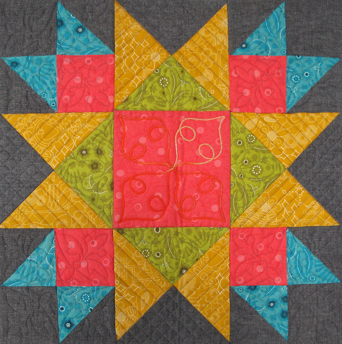
Plus itt was an easy block to take from the small size and increase it to a 60" x 60" finished quilt (and I was all about making this an easy project). The colors were easy to work with, too. I kept the yellow, light blue, and pinkish red colors from the original block because these are close to the three base colors of the CMY system (cyan blue, magenta red and yellow)—one of my favorite color systems. These three colors just look great together.
I did add an additional square in the center placed on-point. Or does that make it a diamond and not an on-point square? Ah, at any rate, the red center represents the red in the BERNINA logo, and the three shades of golden yellow radiating out from the BERNINA red center represent the 125 year celebration of BERNINA's golden anniversary this year.
There are some funny color theory things happening in this quilt. First of all, if you're looking at the center block, the dark shade of golden yellow can start to appear to have a greenish tint. This phenomenon of human color vision is called simultaneous contrast. When your eyes focus on the red for a long period of time, the opposite visual color of green starts to appear next to it in that gold, and all of a sudden you think that you're looking at a dark mossy green color.
The other trick of the eyes may make the center square start to look more like an orange-red than a true red as the strong magenta red squares affect your perception of the reddish colors compared to each other.
Here's what I learned from this quilt. The simpler the geometric design is, the harder it is to get it right. I really struggled with my color choices, and the center block design. I ended up drawing several different design choices and colored them in different ways, and then spent about two weeks just looking at the different designs until I settled on this one. And I still wasn't sure it would work until I got it all together, although I like it better now that it is finished.
For sure, I have a brand new respect for quilters who have the ability to work with large-scale, graphic, simple geometric designs and make it look so easy. I'm not sure I'll ever be able to accomplish a design like this again, this was a difficult assignment to tackle!
How about you, have you ever tried to create a large-scale graphic design in a quilt? How did it work for you? I'd love to see photos, please share in the comments or give me a link!
Until next time, happy stitching!
Erika


Comments