My temperature quilt may look simple, but it depicts a very special year. Each single color block depicts the high temperature of one day, with the top left corner representing the week we were married (August 19-25, 2007). The following blocks read from the top, across and down like reading a paragraph in a book, showing our first year as newlyweds. Near the bottom right corner is our first wedding anniversary date.
I used a simple method for tracking the weather data and recording it on paper templates to make the blocks for this quilt. This method made it easy to paper piece the colors across all the blocks, and keep the blocks in order when it was time to sew the top together.
And you know what? I'm sharing a detailed, 3-part, step-by-step tutorial to make this quilt with the temperature data of your choice in How to Make a Temperature Quilt here!
In this post I'll give some very specific information for choosing fabrics, finding historical temperature data, and fine-tuning the colors in your temperature quilt.
The quilt finishes at 4.5' x 5' and is the perfect couch cuddle size. That's what I expected to use it for, but when my family saw the finished quilt my husband decided it would look best hanging on the wall! I'm in the process of adding a hanging sleeve, and we will display it above our living room couch. It's perfect timing for our 15-year wedding anniversary this fall.
How to select a color palette:
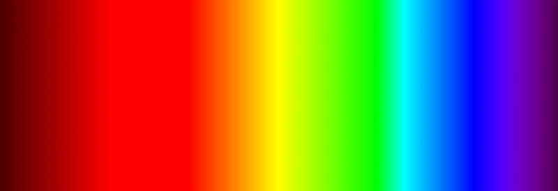
To make the illusion in this quilt work to represent rising and falling temperatures, you will need to select a minimum of 15 temperature ranges represented by different colors. These colors should be organized in visual spectrum order to make the illusion work (think rainbow order).
Break down the temperatures in your area by finding the average high temperature and the average low temperature, and find how you can break-up this range into smaller bits. You can read more about this in my tutorial linked above.
When assigning colors to each of the temperature ranges, think about how reds, oranges, and yellows can represent warm or hot temperatures, and how light, medium, or dark blues can represent cool or cold temperatures. You can also check out how other quilt makers approach a temperature quilt color palette
in this awesome article from the MQG.
I selected a range for warm temperatures starting with a bright magenta red and including red, red orange, orange, yellow, and a warm yellow green. I made the decision to leave off any green colors and skip directly to some of the green blue colors to represent cooler colors. That's why you don't see any absolute green hues in my quilt. You can choose to use WHATEVER colors you wish!
The only restriction you will find with selecting colors is what you can actually find available in solid color fabrics. I suggest having a general idea of what you'd like to do with a color palette, but not finalizing your ideas until you shop for fabrics to see what you can actually find.
Start with Kona solids since they have a wide variety of colors, and also look at other solids to see what will fit in with your framework. Don't get stuck looking for the EXACT color you imagine because you may not be able to find it. It's also easier to look in person and have your fabrics with you than search online.
Here's my final color palette, based on a mix of solids from various manufacturers.
Where to find historical temperature data:
If you live in or near a major city, there's probably a weather station near you, making it easy to find historical weather data including daily high temperatures. Try the simple step of typing in your city, the year for which you are searching, and something like "temperatures" to see what comes up.
I used this website https://www.wunderground.com/ to pull my historical data. This website allows you to enter your search data and will return a whole list of weather data, including high and low daily temperatures (if you scroll down to the bottom of the page).
You can also use https://www.weather.gov/ by clicking on the map to find your area, and then selecting "Past Weather" to see what data is available.
How to fine-tune the temperature/color data in the quilt:
In the step-by-step tutorial, paper templates are used to help you keep track of the dates, temperature data, and color choices. Once you start recording the data in each weekly block pattern, you can see how the colors are going to stack up together.
Keep a close eye on the colors. If you see too many colors in a row, which would indicate a period of time with little temperature changes, you may want to update the block to avoid a really large block of solid color in the finished quilt.
If the temperature in one of those days is within 1 degree of moving either up or down into a different color block, maybe you want to consciously make that change. I did this in about 2 or 3 blocks that otherwise would have been one solid block of color for the sake of creating a more interesting looking finished quilt.
But in the end, it's all up to you! I hope you enjoy the freebie!


Comments