Introducing The Visual Contrast Color Wheel
I'm a total freak for color theory and how humans try to analyze color! After reading so many books about color and color vision, I realize now how different the process of human color vision is from the type of color theory I learned in art school.

I'll show you what I mean. Look at a few of the most prevalent color systems used to find color harmonies (those color combinations utilized by designers, artists, quilters, florists...almost anyone creating with color) pictured below. These 3-Pigment Primary color systems illustrate how pigments like paints, dyes, and inks mix together. The Artist's wheel illustrates how red/yellow/blue pigments mix together, and the Printer's wheel illustrates how cyan/magenta/yellow mix together. These 3-Pigment Primary color wheels have been around for over 100 years and are a good guide for absolute beginners to learn pigment mixing.
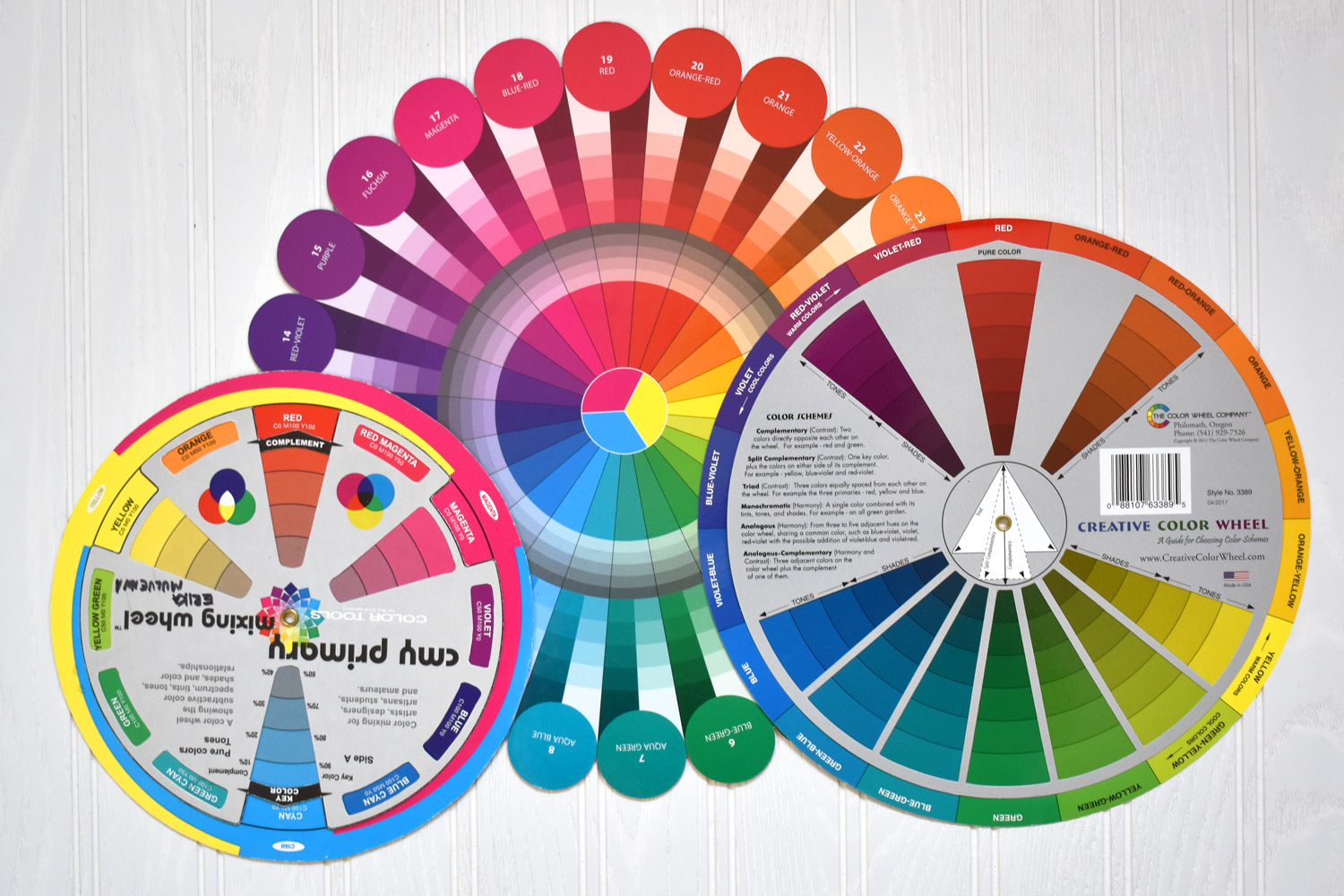
Notice how the colors directly across from each other (aka complementary color harmony) on these 3-pigment primary wheels are slightly different on each wheel. A complimentary pair including the color red can be (from left to right) red/cyan, red/aqua green, or red/green.
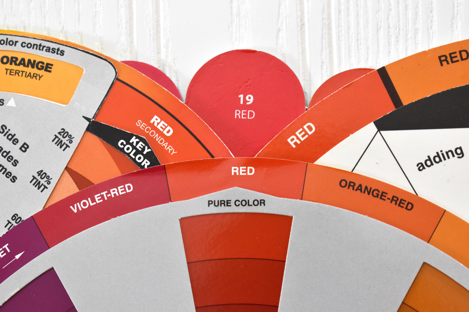
Plus, I've noticed hues in different color wheels with the same name can look quite different. All of these reds have a slightly different hue, from a more magenta-red through to a more red-orange.
I've used both the Artist's and Printer's color wheels to run through several color combination exercises in the past several years. Like the Triangles quilt below based on the Artist's red/yellow/blue system.

And this color theory sampler is based on the Printer's cyan/magenta/yellow color wheel.


Which sparked an idea - if there isn't a color wheel out there based on this system of human color vision, there definitely needs to be (I mean, I definitely would buy one)! So I decided to look at making one myself.

Through my color theory research, I've learned that one idea behind how we see color interactions is explained by the Cone Opponent theory. In a nutshell (there's a lot more going on in the process and this is a simplified example 😉), humans have 3 types of light wave detectors in our eyes called cones that recognize light as either red, green, or blue. Some of the cones are hard-wired together in small groups forming either/or switches called opponent channels, recognizing if the light is either red or green, or yellow or blue. The primary color information from the cones (is the light red, blue, or green?) and the color information from the opponent channels (is the light red or green, or is the light yellow or blue?) are processed together along with many other bits of information to create color consciousness.
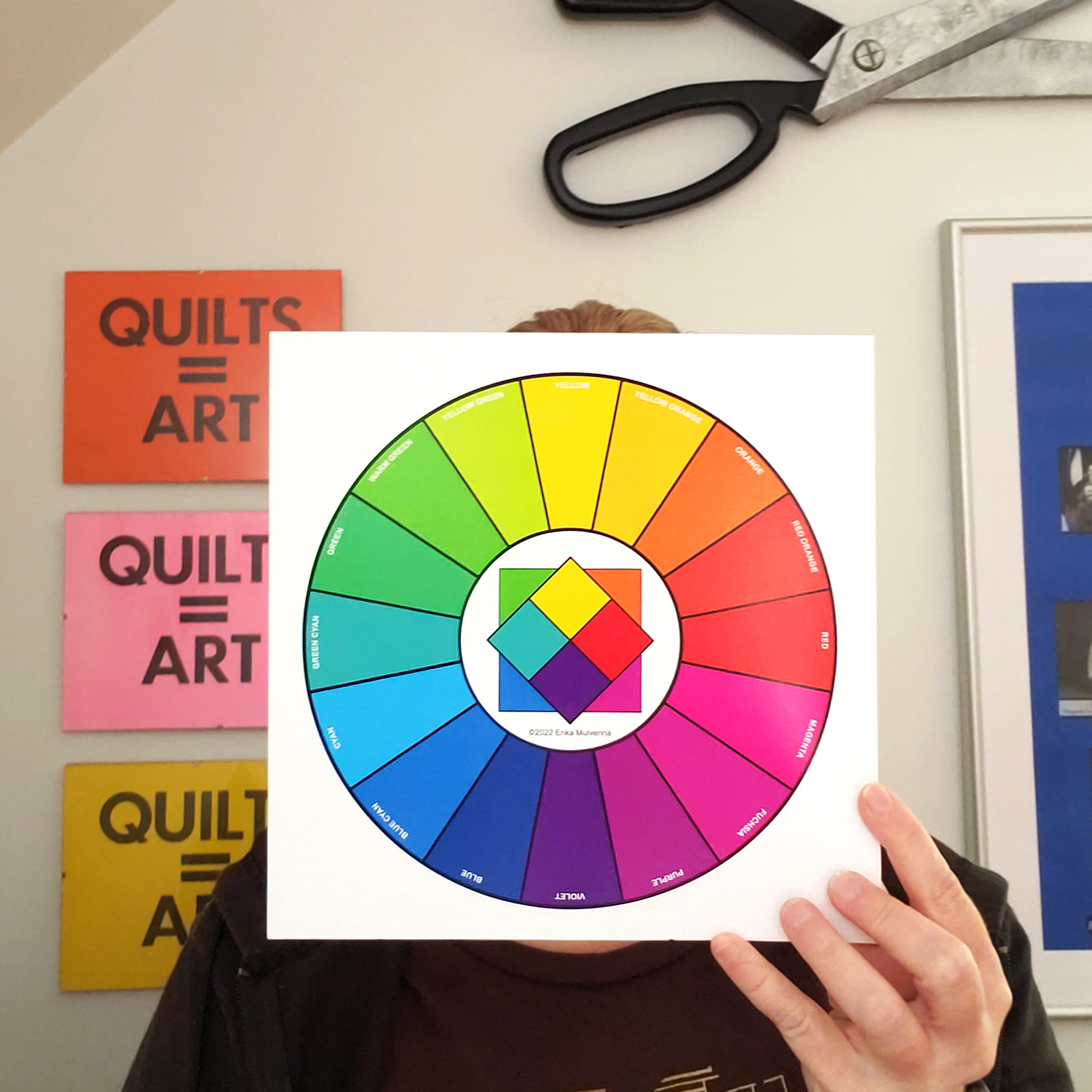
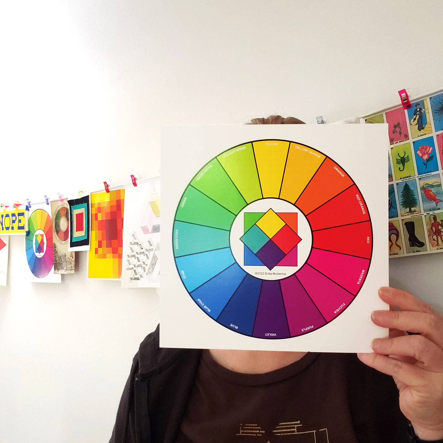
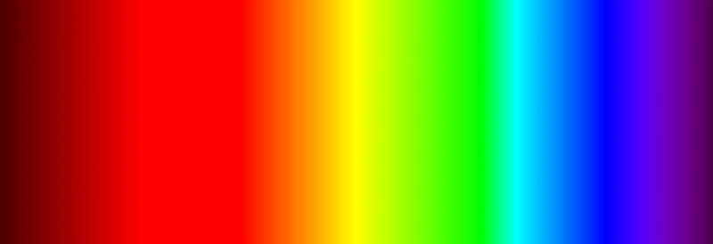
This process can explain the illusions of seeing color after images and color interactions like simultaneous contrast that affect how humans experience color compositions, and this is the process I used to inform my color wheel. Beginning with the two cone opponent color pairs, red/green and yellow/blue, I built out the color wheel to 16 colors. These color pairs represent the experience of successive and simultaneous contrast in color vision. You know, that illusion of staring at a red shape for 60 seconds and then looking at a white space - you're going to experience some form of green or blue-green color that isn't really there.

This task was something I just couldn't tackle alone, and I worked with both designers and printers to make this color wheel a reality. I used a Pantone deck to pick the best color representation for each of the 16 hues in order to communicate the colors to my color wheel team. This wheel has been through several versions! Many test printouts, color refinements, and edits to get to this point - and I'm really excited about how awesome it looks.

I'll now be using this wheel to teach, and you can take my "What is a Color Wheel?" lecture to learn more about what color wheels are in general, how they are used, and what's special about this one. My "Building Color Confidence" class will show you a number of ways to use this wheel in your creative practice. If you're interested, please drop me a line or visit the "Lectures and Workshops" tab above.
And yes, the Visual Contrast Color Wheel will be available for purchase soon! I'm just working out all the little details for printing, shipping, and online sales (phew!).


Comments