Yellow + Blue ≠ Green

I just finished this visual experiment to check out the theory in Michael Wilcox's book, Blue and Yellow Don't Make Green.

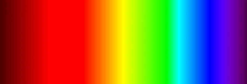
The theory that yellow and blue don't mix to create green is based on the physics of light being absorbed and reflected by a colored surface. We have a simple idea of how this works like sunlight shining on green grass; all the wavelengths of light other than green are absorbed by the grass and the medium wavelentghs that we perceive as green are reflected, giving the grass its green color.

But Wilcox points out that green absorbs most of those other rays of light, but there are still other light waves from the spectrum (long and short wavelengths we perceive as other colors) reflected along with the green. We perceive the green color because that wavelength dominates the reflected mix. So, when you have green- and yellow-colored particles together, there begins an interesting dance of light waves, first reflected from each particle, then re-absorbed by the other particle, and finally, the only mix of light that can escape reads as a muddy gray instead of a green.
Anyway...I wanted to try this out myself with mixes of blue and yellow in the form of fabric and fine tulle netting to see it with my own eyes.

I started with a simple sketch that was also a map of how I was going to play with the layers of netting and fabric. Some netting would be overlayed on the opposite-colored fabric in different layers, and some of the netting would be layered in both colors on top of white fabric. In my mind, I was convinced that in some parts of this piece, it would start to look green.


Before taking a closer look, let me just say what a pain in the ass it was working with many layers of fine tulle netting. Even though I basted the netting flat before sewing the patchwork, once the seam was turned under it caused the top layers to pull slightly more than the bottom layers. Plus, once I started adding quilting stitches, the top layer was pulled even tighter (as the stitches pulled the top layer down through the puffiness of the batting) which caused catastrophic puckering of the bottom layer of fabric. At first, I tried ripping out the quilting stitches and trying to distribute the extra fullness, but it wasn't working, so I just continued along with the inherent puckers and tucks.
So yeah, be prepared to see some wonky, squidgy, funky-ass stuff going on in these close up photos!
Section 1 up close.

Definitely not green, but with enough layers ofblue tulle netting over the yellow you start to see a blueish tint. But just a few layers of blue on the yellow results in a really muddy, gross color.
Section 2 up close.
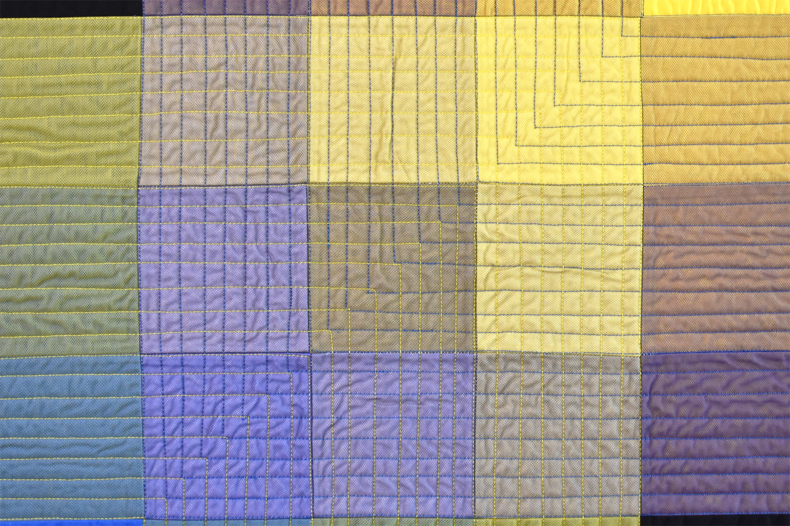
Here the netting is layered on top of white fabric. More yellow netting than blue results in a yellowish color, and more blue netting than yellow results in a bluish color. What really surprised me is how the center square of equal parts yellow and blue really read as a muddy gray! Wilcox was right.
Section 3 up close.

This section came the closest to making a greenish color. It doesn't look like it here, but in person with a bright enough light the many layers of yellow over blue take on a greenish tint. This combination is a lot less muddy than the blue layers of netting on top of the yellow fabric.

Definitely, a COOL experiment in the physics of light and human color perception! Not so much the part about sewing with multiple layers of tulle - but I'm glad for that lesson as well.


Comments